This post may contains affiliate links. Read our full disclosure here.
The best pastel home decor ideas for spring don’t require a full renovation or an unlimited budget — they require the right color palette, a few key accent pieces, and a clear sense of how to layer softness without tipping into saccharine. Spring is genuinely the most beautiful season to decorate for: the light changes, the outdoor world blooms, and your home has an opportunity to reflect all of that freshness and possibility. Pastels — done well — are the ultimate expression of spring interior styling.
Whether you’re refreshing a single room or giving your whole home a seasonal update, this guide walks through every angle of pastel spring home decor: the best color combinations, room-by-room ideas, how to style pastels for adults (not just nurseries), and the specific pieces worth shopping. Let’s dig in.
“Pastels for spring aren’t about going soft on style — they’re about bringing the outside in. The palette of the season is already there; your job is just to echo it.”
Why Pastel Home Decor Works So Well for Spring
There’s a reason pastel home decor trends so reliably every spring: it mirrors what’s happening outside. Cherry blossoms, tulip fields, baby blue skies, new green growth — the entire spring color story is soft, slightly muted, and luminous. When you bring those same tones indoors, your home feels like an extension of the season rather than a sealed-off box.
From a design standpoint, pastels also work because of their relationship with light. Spring brings longer, brighter, more directional natural light into your home, and soft pastel hues respond beautifully to that light — they glow, they shift through the day, they make rooms feel larger. In winter, those same colors can look washed out or cold. In spring, they come alive.
The other thing I love about pastel spring decor is how non-committal it can be. You don’t need to paint walls or buy new furniture to adopt a pastel palette. Throw pillows, a new throw blanket, a ceramic vase, fresh flowers, a set of linen napkins — these are the levers you pull to shift a room’s energy toward spring, and they’re all completely reversible when the season changes. That’s the beauty of a seasonal refresh.
What makes pastel home decor ideas go wrong is usually one of two things: too much pink (reads nursery, not chic) or too many different pastels at once without an anchoring neutral. Both problems are easy to solve once you understand the underlying structure of a well-done pastel palette.
The Best Pastel Color Combinations for Spring Decor
The foundation of any successful pastel spring home decor scheme is color combination. Here are the palettes I come back to every year — each one is grounded, versatile, and genuinely beautiful in a real living space.
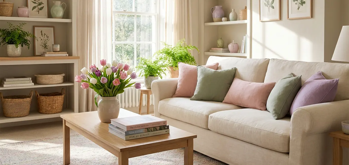
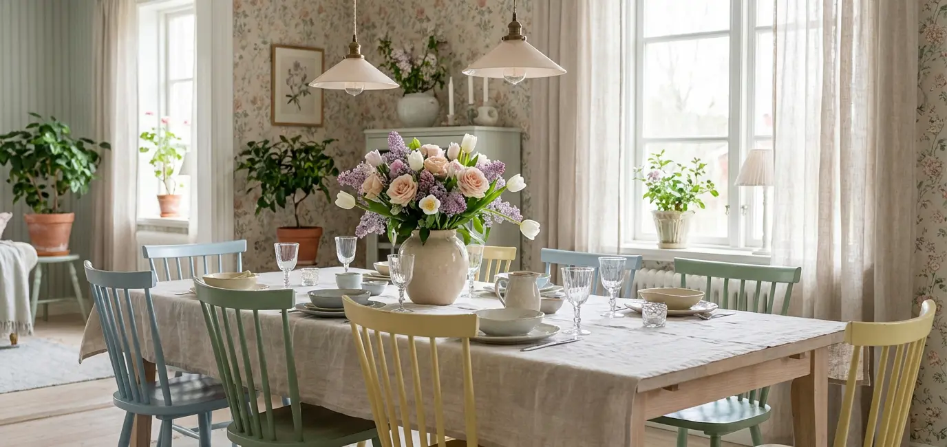
1. Sage Green + Cream + Blush Pink
This is the most universally flattering pastel home decor palette available right now, and for good reason. Sage green reads as both nature-inspired and sophisticated. Cream grounds the palette and prevents it from floating too light. Blush pink adds just enough warmth to keep things from feeling sterile. Together, these three tones make a room feel like it was styled in a Provence farmhouse — elevated, fresh, and effortlessly put-together.
Best application: living room and bedroom. Use sage as the dominant color (a sofa, an accent wall, large pillows), cream as the base (linen drapery, throws, rugs), and blush as the accent (a single vase, fresh flowers, a toss cushion or two).
2. Lavender + White + Warm Gold
Lavender is having a sustained moment in interior design, and it earns its place in pastel home decor for spring. It’s softer and more interesting than baby blue, and when paired with crisp white and touches of warm gold or brass, it feels genuinely luxurious rather than juvenile. This is the palette for a bedroom that feels like a spa retreat or a dining room that looks like it was photographed for a design magazine.
The key is to keep the lavender soft — muted and dusty rather than saturated or bright. Saturated purple is a different design statement entirely. The pastel version, in the right proportion, is both feminine and grown-up.
3. Sky Blue + Linen + Terracotta Accent
This palette is slightly warmer and earthier than the others, which makes it a great choice for spaces that already have natural wood tones or warm-toned flooring. Soft sky blue — think the color of an early spring morning sky — is airy and calming. Linen neutralizes it without cooling it down. And a small terracotta accent (a single pot, a textured ceramic) grounds the whole palette in something organic and real.
4. All-Blush with White and Natural Wood
Sometimes the most effective pastel home decor ideas are the simplest. An all-blush palette — with white trim, white walls, and natural light wood furniture — creates an incredibly clean, editorial look that photographs beautifully and feels genuinely serene to live in. The risk here is going too pink; the fix is keeping the blush in textiles only (duvet, throw, curtains) and letting the white walls and wood tones do the structural work.
Pastel Spring Decor Ideas Room by Room
The most effective approach to pastel home decor ideas for spring is to work room by room rather than trying to transform everything at once. Here’s how each space in your home responds to a pastel spring update.
Living Room: The Anchor Room
Your living room is where a pastel spring decor scheme has the most impact — and also where it’s easiest to go wrong. The key is using pastels as accents against a neutral base, not as the dominant color story. Keep your sofa, rug, and largest furniture pieces in cream, linen, or warm white. Then layer pastel through throw pillows (sage, blush, lavender — pick two colors maximum), fresh flowers in a ceramic vase, a pastel-toned throw, and a botanical print or two on the wall.
The result should feel fresh and seasonal, not like you’ve repainted everything pink. If your living room has existing warm neutrals — tan walls, wood floors, leather accents — sage green and blush are the pastel tones that will harmonize most naturally.
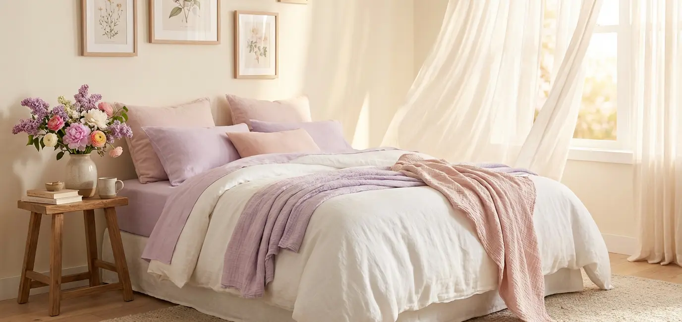
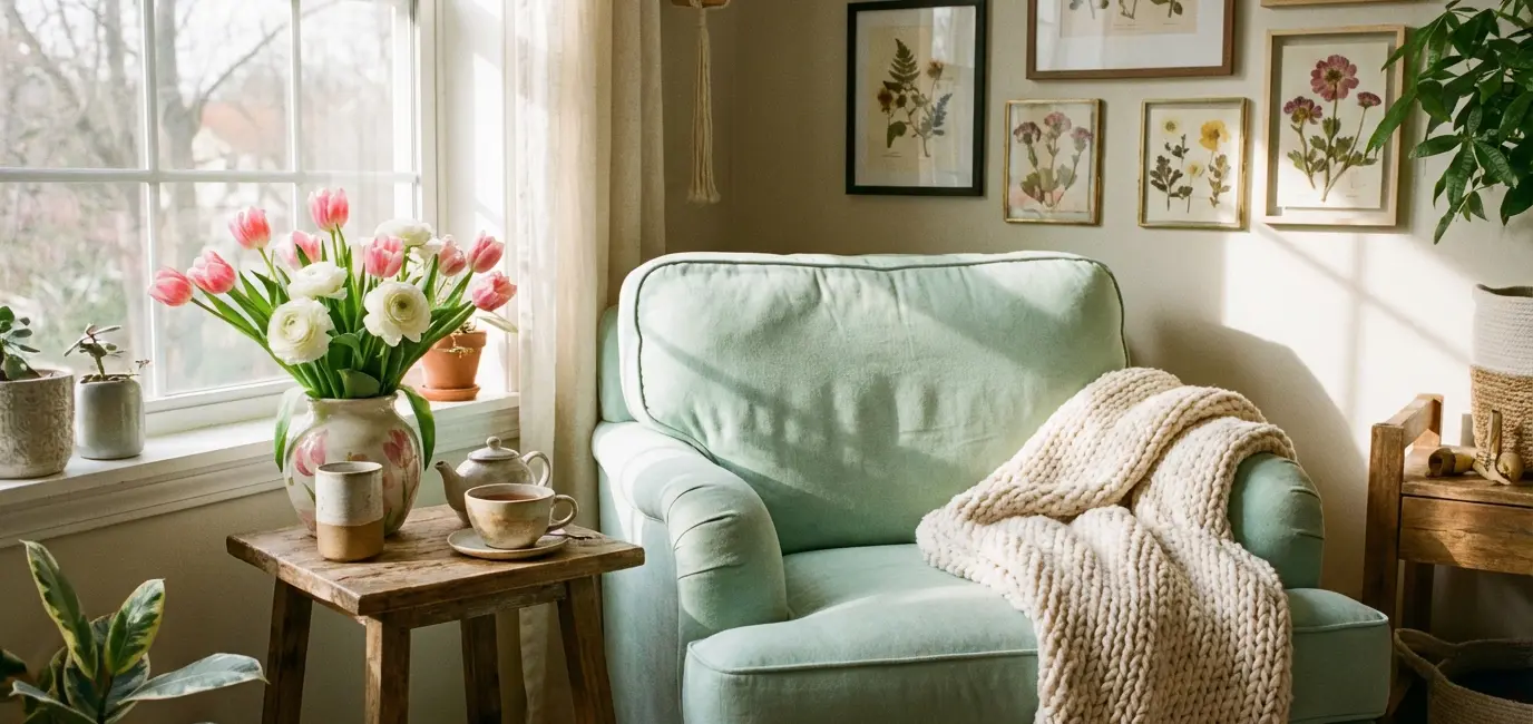
Bedroom: Where Pastels Shine Most
The bedroom is where pastel home decor genuinely excels. Bedding is the single most transformative seasonal swap you can make: replace a heavy winter duvet cover with a light linen duvet in blush, lavender, or pale sage, and your bedroom immediately looks and feels like spring has arrived. Add a botanical print above the headboard, swap the nightstand lamp for something with a warmer, softer shade, and place a small vase of fresh tulips or ranunculus on the nightstand. That’s it. The whole room shifts.
For a more elevated pastel spring bedroom, layer two colors: a blush duvet with sage green euro shams, or a lavender throw at the foot of a white linen bed. Keep everything else neutral — wood tones, white, cream — and let the two pastel accents do the work.
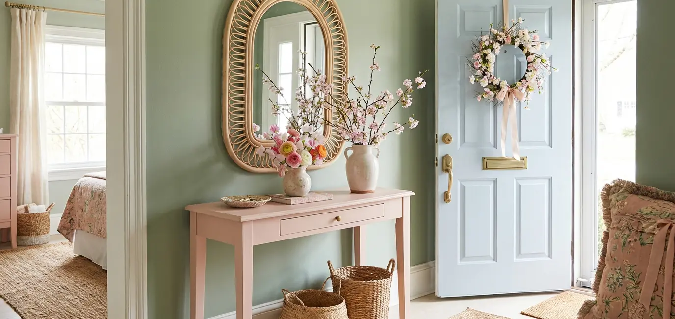
Entryway: First Impressions with Pastel
Your entryway sets the tone for the whole home, and a pastel spring decor update here has an outsized impact relative to its size. A fresh spring wreath in blush and green, a ceramic vase with fresh flowers, a light rattan mirror, a pastel-toned table runner on your entry console — these are small moves that immediately communicate “spring is happening here.” If your entryway has any wall space, a single botanical print in a white frame is the easiest, most polished upgrade you can make.
Dining Room: Pastels for Entertaining
The dining room is where pastel home decor ideas translate most directly into your entertaining aesthetic. A linen tablecloth in pale sage or blush, linen napkins in a complementary pastel, a centerpiece of mixed spring flowers — this is the setup that makes guests stop and take a photo of the table before they sit down. If you’re hosting Easter dinner, a spring brunch, or any spring gathering, this palette is the one that makes the whole table look effortlessly styled.
How to Layer Pastels Without Making It Look Childish
The most common fear around pastel home decor for adults is that it will tip into nursery territory — too sweet, too precious, too obviously “spring-themed.” Here’s how to avoid that and keep your pastel spring decor looking sophisticated and intentional.
Rule 1: Maximum Two Pastel Colors Per Room
More than two pastel colors in a single space starts to read like an Easter basket rather than a design-forward interior. Pick your two heroes — say, sage green and blush — and repeat them at different scales and textures. A sage green throw pillow, a blush ceramic vase, a sage green botanical print, a blush linen throw. Two colors, four applications, completely cohesive.
Rule 2: Always Anchor with a Strong Neutral
Every successful pastel home decor scheme needs something that grounds it: a warm white wall, a natural linen sofa, a light wood floor, a cream area rug. The neutral is what stops the pastels from feeling unmoored or childish. Think of it as the container that holds the pastels. Without it, everything floats.
Rule 3: Texture is What Makes Pastels Feel Grown-Up
Smooth, shiny, or plastic-looking pastel surfaces read juvenile. Textured, organic, matte pastel surfaces read sophisticated. Linen duvet in blush = beautiful. Satin throw pillow in baby pink = less so. Seek out pastels in natural materials: linen, cotton, ceramic, rattan, woven wool, matte paint. The material quality is as important as the color.
Rule 4: Let One Room Anchor the Palette
You don’t need pastel in every room to have a cohesive pastel spring home decor scheme. In fact, the most effective approach is often to go deeper in one room — layering multiple pastel tones with intention — while keeping other rooms in simple, clean neutrals with just a nod to the season (a fresh flower arrangement, a botanical print, a light throw). This creates a natural flow through the home without anything feeling overdone.
The Best Pastel Decor Pieces to Shop Right Now
Ready to actually refresh your home with pastel home decor ideas for spring? Here are the specific categories and pieces worth shopping — curated to work across the palettes and principles above.
Throw Pillows (The Fastest Seasonal Swap)
Throw pillows are the single most cost-effective way to shift your living room into a pastel spring decor palette. Look for linen or cotton covers in sage green, blush, and soft lavender — mix textures (a subtle stripe, a plain weave, a delicate floral) within the same color family. Budget $30–60 for a set of two, replace them in fall, and your sofa looks seasonal all year long.
Botanical Wall Art (The Room-Changer)
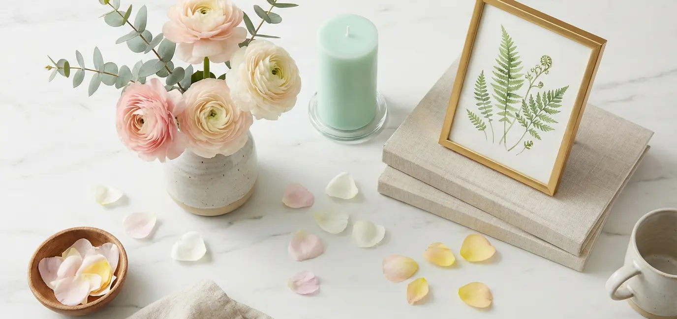
A botanical print is the single most versatile piece of pastel home decor you can add to a spring room. It works in every room, at every size, with every palette. Delicate watercolor botanicals in blush and green, vintage pressed flower prints, minimalist line drawings of spring blooms — all of these read as sophisticated, spring-appropriate wall art that works year-round (not just in April). Art.com has one of the best botanical print collections available online, with options from museum-quality archival prints to affordable reproductions.
Scented Spring Candles (The Sensory Layer)
The pastel spring home decor experience isn’t just visual — scent is part of it. A spring candle in a soft pastel vessel (blush pink, sage green, cream) does double duty: it’s a decor piece that also fills your home with the scent of spring blooms, fresh linen, or green tea. Look for soy or coconut wax candles in spring-inspired scents: peony, jasmine, fresh cut grass, white tea. These make the whole atmosphere of your home feel seasonally refreshed, not just the visual.
Fresh Flowers (The Non-Negotiable)
No amount of pastel spring decor styling fully lands without fresh flowers. A single bunch of tulips in blush or white, ranunculus in cream and soft pink, peonies if you can find them — fresh flowers in a simple ceramic vase are the element that ties every pastel palette together and makes it feel genuinely alive. Budget $10–15 per week for a rotating bunch from your grocery store and rotate through colors that complement whatever you’ve styled in each room.
More Spring Home and Decorating Guides
If this guide has you in a full spring decorating mode, there’s plenty more on the site. For the living room specifically, my small living room decorating ideas guide covers every principle for making a room feel bigger, brighter, and more intentional — all of which apply directly to a pastel spring refresh. For tablescaping inspiration for your spring entertaining, the spring tablescaping ideas 2026 guide has the full framework. If you’re also refreshing your bedroom this season, my spring bedroom refresh ideas guide goes deeper on the specific swaps that make the biggest impact. The botanical print gallery wall ideas guide is essential reading if you’re adding art this spring — it covers layout, frame mixing, and which print styles are worth investing in. And if you’re hosting a spring dinner party to show off the newly decorated space, spring dinner party menu ideas has everything you need for a meal that matches the moment.
Frequently Asked Questions
Still planning your pastel home decor for spring? Here are the questions I hear most often.
What is the most popular pastel color for spring home decor?
Sage green is currently the most popular pastel home decor color for spring, followed closely by blush pink and soft lavender. Sage green has held its place at the top of interior design trends for several years because it works with every neutral base, reads as both natural and sophisticated, and transitions seamlessly from spring through the rest of the year.
How do you decorate with pastels without it looking like a nursery?
The key to sophisticated pastel spring decor is limiting yourself to two pastel colors per room, anchoring everything with a strong neutral (white, linen, natural wood), and prioritizing textured, organic materials over smooth or synthetic ones. Linen, cotton, ceramic, and rattan in pastel tones read grown-up; shiny or plastic-looking pastels read juvenile.
What are the best pastel color combinations for spring?
The best pastel home decor color combinations for spring are: sage green + cream + blush pink (the most universally flattering), lavender + white + warm gold (for a luxurious feel), sky blue + linen + terracotta accent (for warmer spaces), and all-blush with white and natural wood (clean and editorial). Any of these palettes works beautifully when the proportions are right — dominant neutral, secondary pastel, accent pastel.
Can you use pastel decor year-round or just for spring?
Certain pastel tones work year-round: sage green in particular is essentially a neutral at this point in interior design and looks beautiful in any season. Blush and lavender are more seasonal — they feel most natural in spring and summer but can feel slightly cold in winter. The practical answer: swap textile-based pastels (throw pillows, blankets, duvet covers) seasonally, and keep any structural pastel (art, ceramics, furniture) in a tone that works year-round like sage, dusty blue, or warm cream.
What’s the easiest way to add pastel home decor for spring?
The easiest way to incorporate pastel home decor ideas for spring is through throw pillows, fresh flowers, and a botanical print. Swap two throw pillows on your sofa for pastel linen covers, add a bunch of blush tulips or cream ranunculus in a simple vase, and hang a botanical print in a white frame. That’s a complete seasonal refresh that takes under an hour and costs under $100.
Are pastels good for small rooms?
Yes — pastel home decor is especially effective in small rooms. Soft, light tones reflect natural light and make spaces feel more open and airy than saturated or dark colors. In a small living room or bedroom, a pastel palette is one of the most reliable tools for making the space feel larger without any structural changes.
Spring is a genuinely beautiful season to refresh your home, and pastel home decor ideas are one of the most accessible, reversible, and visually rewarding ways to do it. Start with one room, pick a two-color palette, anchor it with a strong neutral, and let the season come inside. The results will surprise you.