This post may contains affiliate links. Read our full disclosure here.
Have you ever walked into a room and instantly felt either relaxed, energized, or maybe even a bit anxious without knowing why? That’s color psychology at work! As someone who’s spent years helping friends redesign their spaces (and obsessively repainting my own apartment walls in college), I’ve witnessed firsthand how different color palettes benefit different rooms. It’s not just about what looks pretty—it’s about how colors can transform our mood, productivity, and even our sleep quality.
In 2025, color psychology in home design is more relevant than ever. With more of us working from home and craving spaces that serve multiple functions, choosing the right colors has become a crucial part of creating a home that supports our wellbeing. Whether you’re planning a total home makeover or just wanting to refresh a single room, understanding how different rooms benefit from different palettes can make all the difference between a space that just looks good and one that feels amazing to live in.
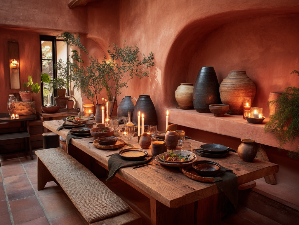
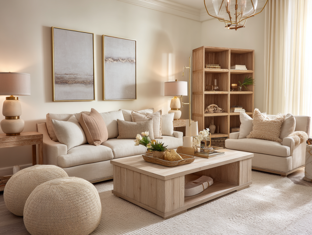
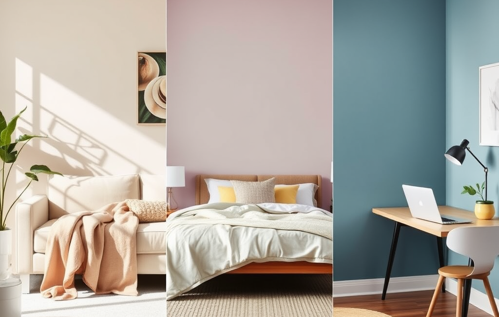
Living Room: Creating Your Perfect Welcoming Hub
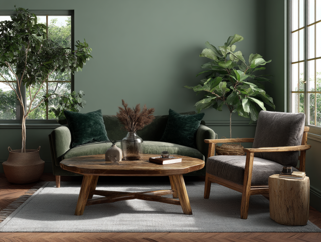
Your living room is where life happens—movie nights, catch-ups with friends, lazy Sunday afternoons with a good book. The best colors for this central space should make everyone feel comfortable while reflecting your personal style. This year, I’m seeing more people gravitating toward colors that create warmth and foster connection.
The most popular living room palettes for 2025 include:
- Warm Neutrals (Beige, Cream, Soft Gray) – These create a timeless, cozy foundation that works with virtually any décor style.
- Earthy Greens & Blues – These nature-inspired tones bring calm serenity to high-traffic areas.
- Soft Pinks & Terracottas – For those wanting a bit more personality, these add modern warmth without overwhelming the space.

One of my favorite designer tips is adding a bold accent wall in deep navy or emerald. It adds depth and drama without dominating the room—perfect if you’re hesitant about using too much color. When my boyfriend and I moved into our home, we painted a single wall in our living room navy blue, and it transformed the entire feel of our space while keeping things balanced.
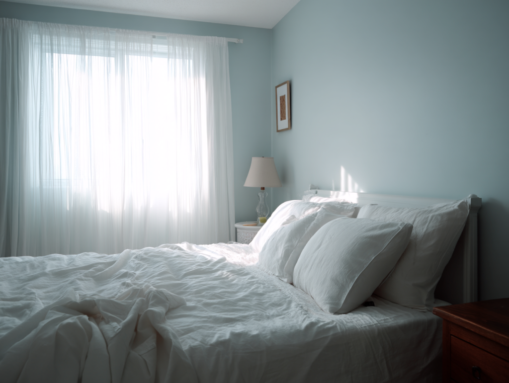
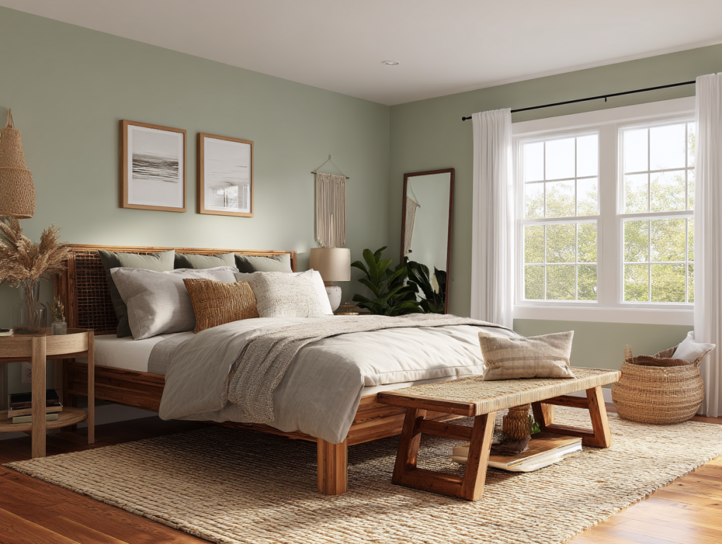
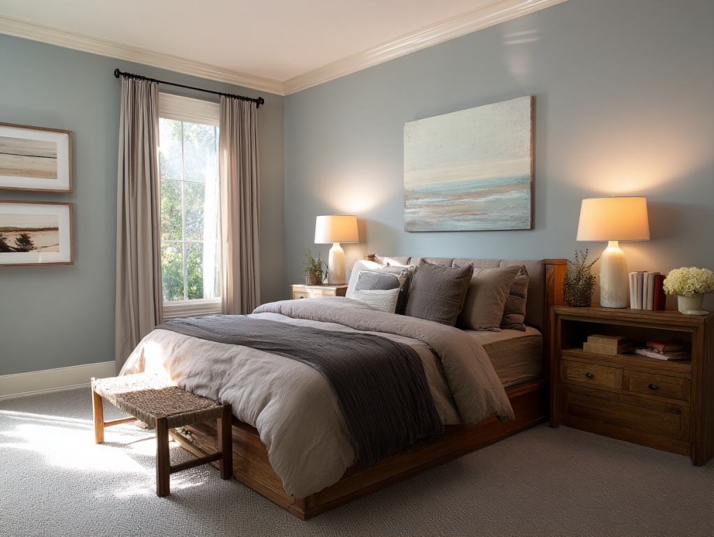
Bedroom: Your Sanctuary of Calm
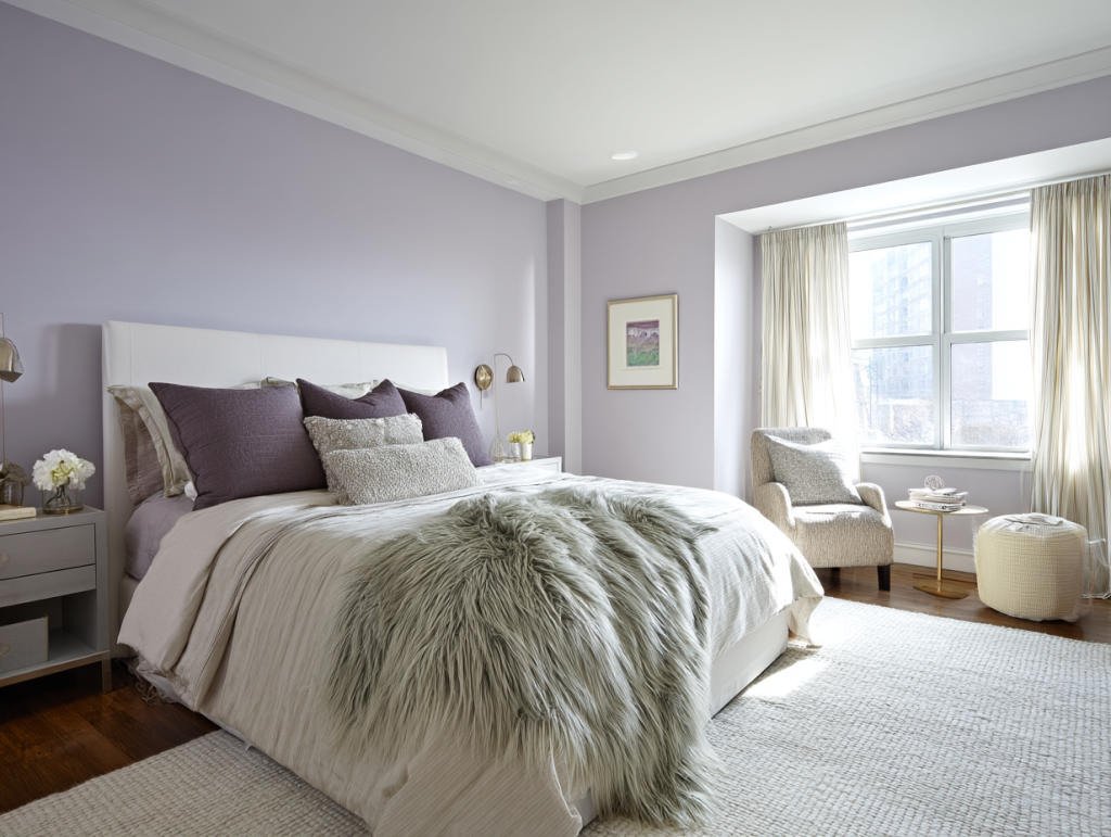
After a long day, your bedroom should feel like a peaceful retreat. This is where color psychology really shows its power—the right hues can actually help lower your heart rate and prepare your brain for rest. My clients often report better sleep after switching to more sleep-friendly colors!
The most sleep-promoting bedroom colors for 2025 include:
- Soft Blues & Lavenders – These cooler tones are proven to lower blood pressure and reduce anxiety.
- Muted Greens – Think sage, mint, or olive—these natural shades mimic the outdoors and promote serenity.
- Warm Whites & Blush Tones – For a gentle, cozy vibe that still feels bright and airy.

What to avoid? High-energy colors like bright reds, oranges, or vibrant yellows. I learned this lesson the hard way in college when I painted my bedroom a cheerful sunshine yellow—then wondered why I couldn’t fall asleep! If you’re planning a bedroom refresh this year, stick with cooler or neutral tones for the walls and save the brighter colors for accents like throw pillows or artwork.
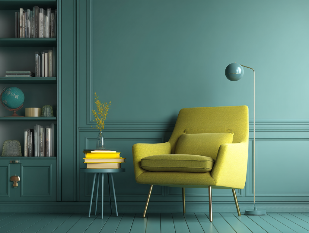
Home Office: Colors for Focus and Productivity
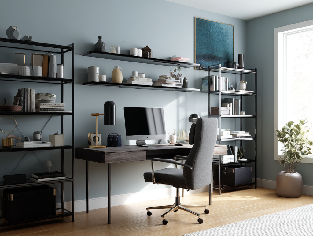
With remote work becoming more permanent for many of us, having a home office that boosts productivity matters more than ever. The colors surrounding you while you work can significantly impact your ability to concentrate, stay alert, and think creatively.
The best home office colors for 2025 include:
- Shades of Green – From sage to emerald, greens improve concentration and reduce eye strain during long screen sessions.
- Blues (Light to Mid-Tone) – These promote focus and efficiency—perfect for task-oriented work.
- Soft Yellows – If your work requires creativity, these sunny tones can boost optimism and innovative thinking.
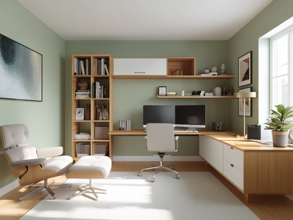
Quick fix for renters or those not ready to commit to paint: add pops of productivity-boosting colors through accessories like desk organizers, notebooks, or framed art. I’ve found that even just adding a green plant to my home office makes a noticeable difference in how long I can stay focused!
Kitchen: Fresh and Energizing Palettes
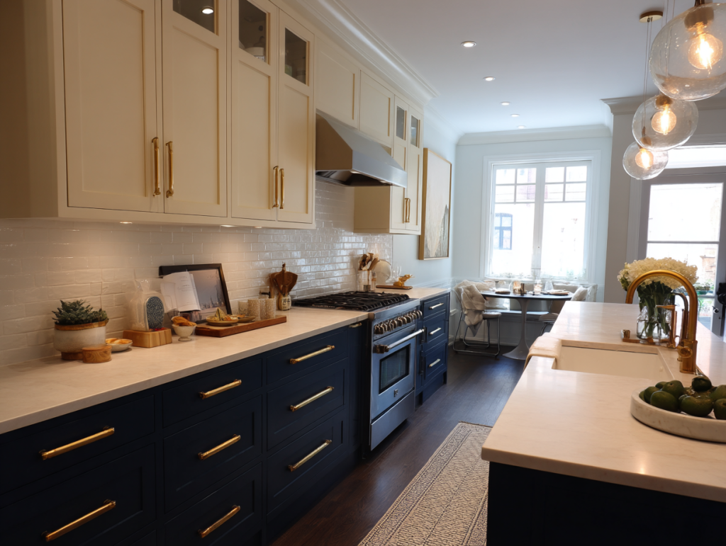
Kitchens aren’t just for cooking anymore—they’ve become command centers, homework stations, and social hubs. The ideal kitchen colors for 2025 should feel clean and fresh while boosting energy and appetite (in a good way!).
Popular kitchen color palettes this year include:
- Whites & Light Grays – Classic, clean options that make spaces feel larger and brighter.
- Sage Green – The kitchen color of the year! Refreshing, natural, and particularly gorgeous with wood tones.
- Sunny Yellows – Used strategically, these happy hues stimulate appetite and conversation.

The biggest kitchen color trend for 2025? Two-toned cabinets with darker colors on lower cabinets and lighter shades on uppers. This creates visual interest while keeping the space feeling open and airy. I recently helped a friend refresh her kitchen on a budget by painting just the lower cabinets deep green while keeping the uppers white—the difference was dramatic!
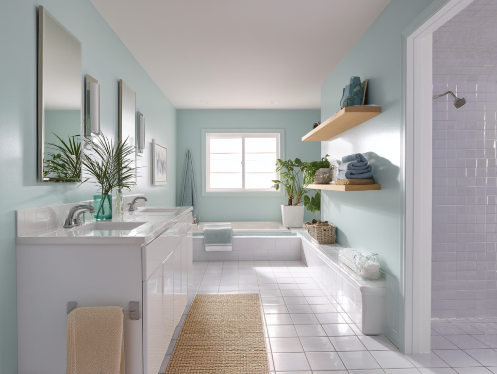
Bathroom: Creating a Personal Spa
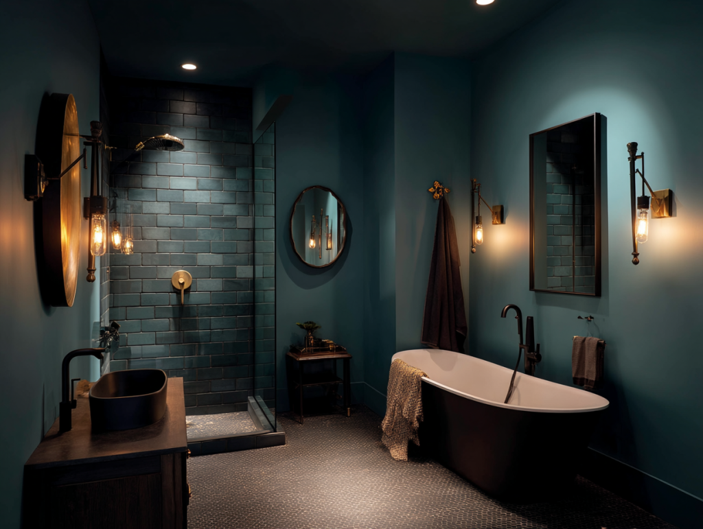
Your bathroom should feel like your own private spa retreat—a place to refresh and recharge. Bathroom colors should promote cleanliness and relaxation, and in 2025, we’re seeing more people choose palettes that create a true sanctuary feeling.
The most popular bathroom color schemes include:
- Crisp Whites & Soft Blues – These clean, classic combinations never go out of style.
- Pale Pinks & Grays – These unexpectedly soothing combinations feel both modern and timeless.
- Deep Teals – Perfect for powder rooms or primary baths where you want a more luxurious, dramatic feel.
My favorite pro tip for bathroom colors: add natural wood accents (think floating shelves or a bamboo bath mat) to warm up cooler color palettes. This prevents the space from feeling too sterile or cold. When curating your bathroom space, remember that small touches like natural elements can make a huge difference in how the colors read.
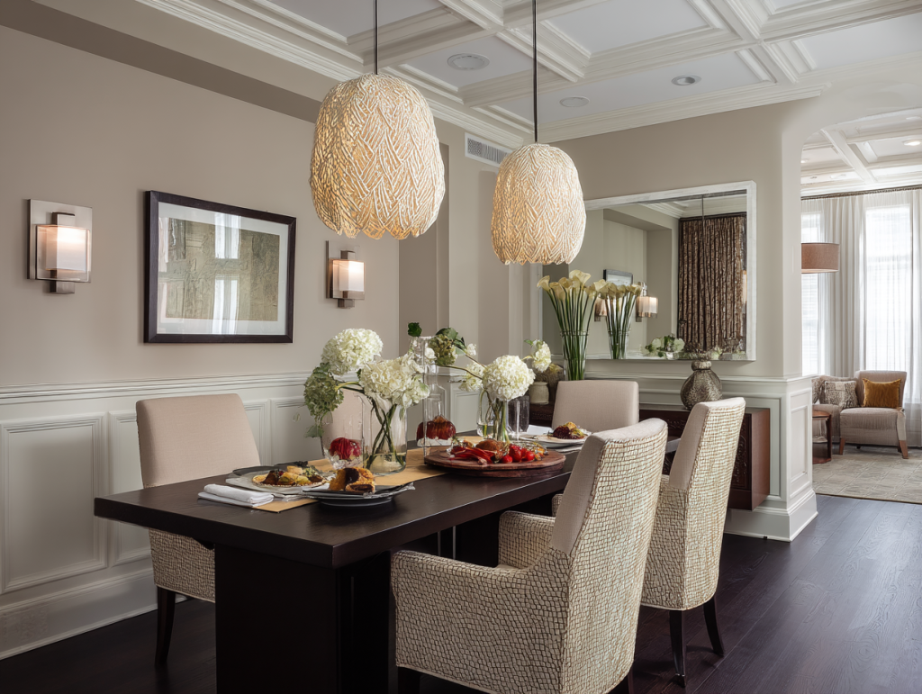
Dining Room: Colors That Inspire Connection

Whether you have a formal dining room or just a dedicated eating nook, the colors in this space should encourage conversation and connection. They should also—fun fact—make food look more appealing!
The best dining area colors for 2025 include:
- Terracotta & Deep Reds – These rich, warm tones stimulate appetite and create an inviting atmosphere.
- Muted Blues & Greens – For a more relaxing, elegant dining experience that still feels intimate.
- Warm Neutrals – These versatile options work with any décor style and let your food and table settings shine.

Did you know warmer colors actually make food look more appealing? It’s true! Restaurants often use reds and warm tones in their décor for exactly this reason. If you’re someone who loves hosting dinner parties, consider how your wall color might be affecting the dining experience.
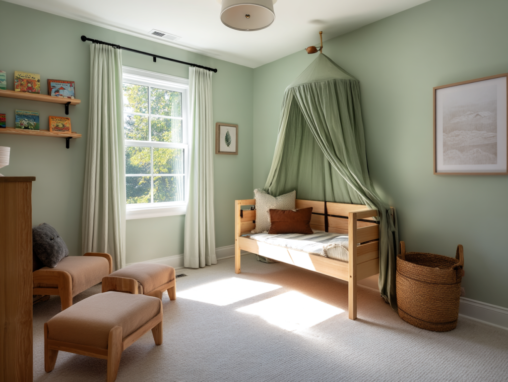
Kids’ Room: Playful Yet Practical
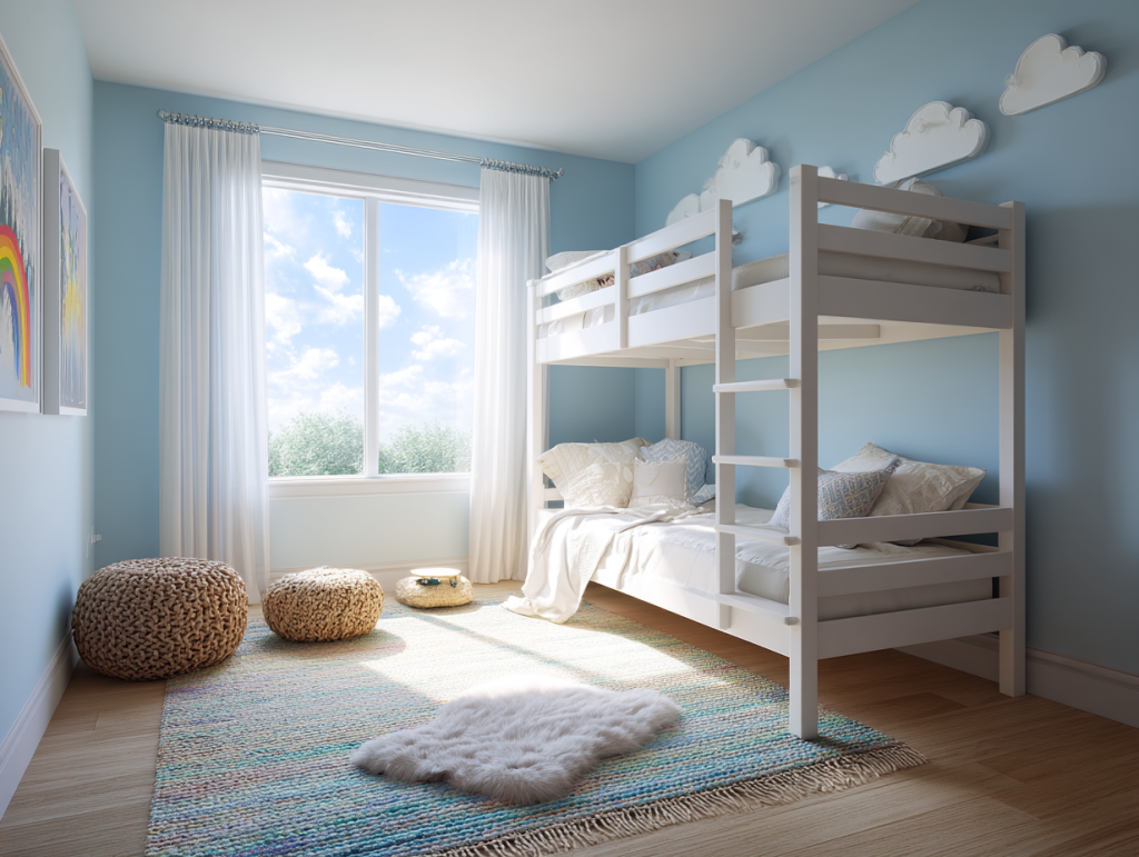
Designing for little ones requires special color consideration. You want a space that inspires creativity and play during the day, but still promotes restful sleep at night. The trick is finding that perfect balance.
Kid-friendly color solutions for 2025:
- Soft Mint or Sky Blue – These gentle colors are calming for bedtime yet still feel fresh and youthful.
- Pastel Yellows & Pinks – Cheerful without being overstimulating.
- Neutral Base + Pops of Color – Start with a versatile neutral then add color through accessories that can easily update as they grow.
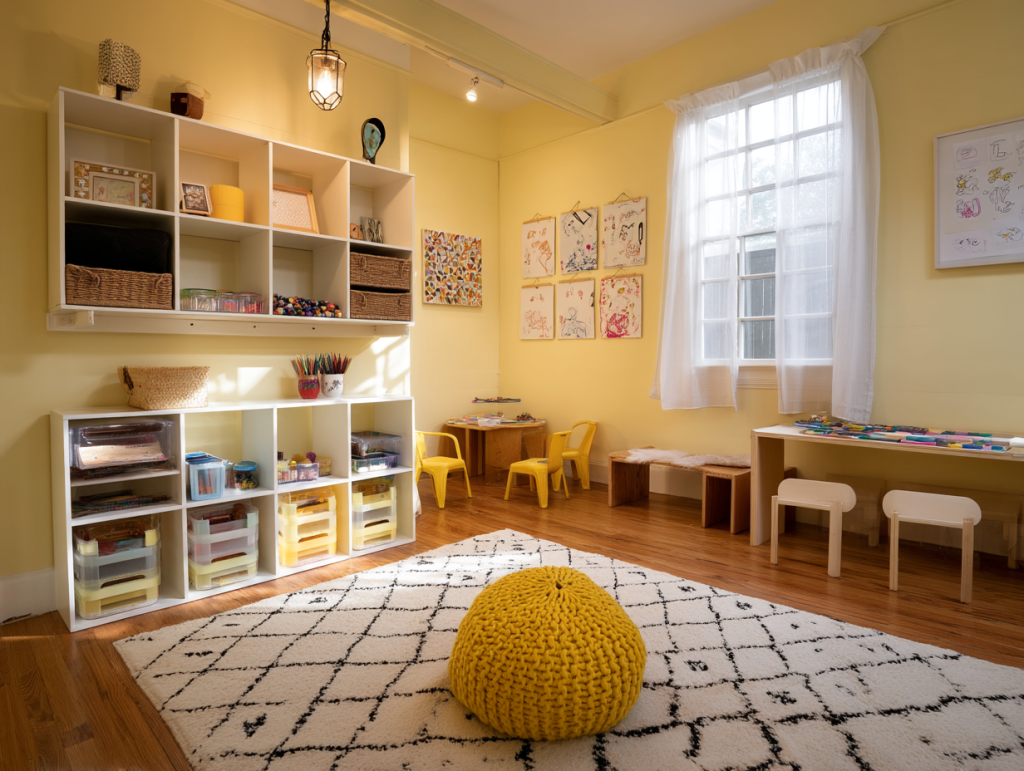
My smartest move for kids’ spaces? Removable wall decals or wallpaper. Children’s preferences change rapidly, and this allows for easy updates without repainting. My sister used this approach in my niece’s room—neutral walls with colorful removable stars that can be swapped out as her interests change.
Smart Color Strategies for 2025
Before you grab that paint brush or order new furniture, here are some final color psychology tips to keep in mind this year:
- Always Test Before Committing – Paint large swatches on your walls and observe them at different times of day. Colors change dramatically under various lighting conditions.
- Balance Bold & Neutral – If using vibrant colors, balance them with softer tones to prevent visual overwhelm.
- Follow Trends Mindfully – It’s fine to be inspired by color trends, but prioritize colors you personally love and respond to.
Colors have the remarkable ability to transform not just how your home looks, but how you feel living in it. By understanding how different rooms benefit from different palettes, you can create spaces that truly support your daily activities and emotional wellbeing. Start with one room that needs attention, experiment with the psychology-backed colors I’ve shared, and watch how your home takes on new life!
Whether you’re painting all your walls or just adding colorful accents, remember that there are no absolute rules—only guidelines. The colors that make you feel good are always the right ones for your space. Trust your instincts, have fun with the process, and enjoy the positive effects that thoughtful color choices bring to every room in your home.