This post may contains affiliate links. Read our full disclosure here.
Have you ever walked into a room and immediately felt calmer, more energized, or even slightly on edge without knowing why? That’s the power of color psychology at work. The colors that surround us do much more than just look pretty—they actively influence our emotional state. Understanding how colors affect your mood can transform your living space from merely decorative to genuinely supportive of your well-being. When we deliberately choose colors based on their psychological impact, we create homes that not only express our personal style but also nurture our mental health.
As someone who’s repainted my bedroom three times in search of the perfect sleep-inducing shade, I’ve learned firsthand that color choices matter deeply. The science of color psychology explains why certain hues make us feel relaxed while others prompt creativity or conversation. Whether you’re planning a complete home makeover or just refreshing a tired space with new accent pieces, recognizing the emotional weight of each color can help you create rooms that truly work for your lifestyle and mindset needs.
The Science Behind How Colors Affect Your Mood
Color psychology isn’t just interior design fluff—it’s backed by genuine research into how our brains process visual information. When light enters our eyes, it triggers hormonal responses that can alter everything from our heart rate to our stress levels. These reactions happen whether we’re consciously aware of them or not, which is why the colors in our homes can subtly influence our daily life even when we don’t realize it’s happening.
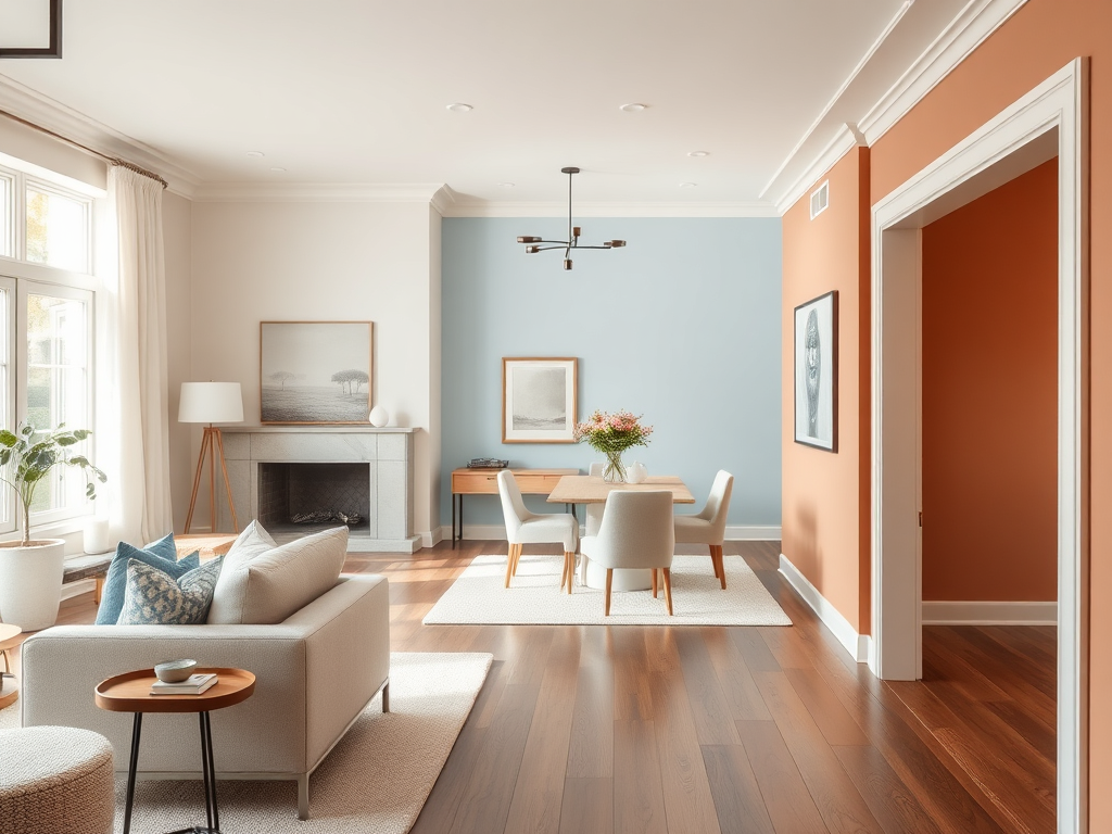
The color spectrum divides broadly into warm and cool categories, each with distinct psychological effects. Warm colors like reds and oranges tend to stimulate the mind and can even raise your blood pressure slightly, while cool tones like blues and greens typically slow breathing and heart rate. Neutrals provide balance and grounding, creating visual spaces for your mind to rest between more stimulating elements.
Understanding these fundamental principles gives you powerful tools for choosing a home decor style that supports your emotional needs. For instance, if you struggle with anxiety, surrounding yourself with primarily cool, calming tones could help create a more peaceful baseline for your nervous system throughout the day.
Key principles of color psychology:
- Warm colors (red, orange, yellow) energize and stimulate conversation
- Cool colors (blue, green, purple) calm and promote rest
- Neutrals (white, beige, gray) ground and balance stronger hues
- Color affects us both consciously and unconsciously
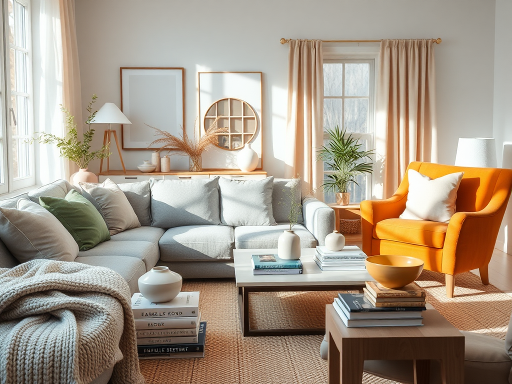
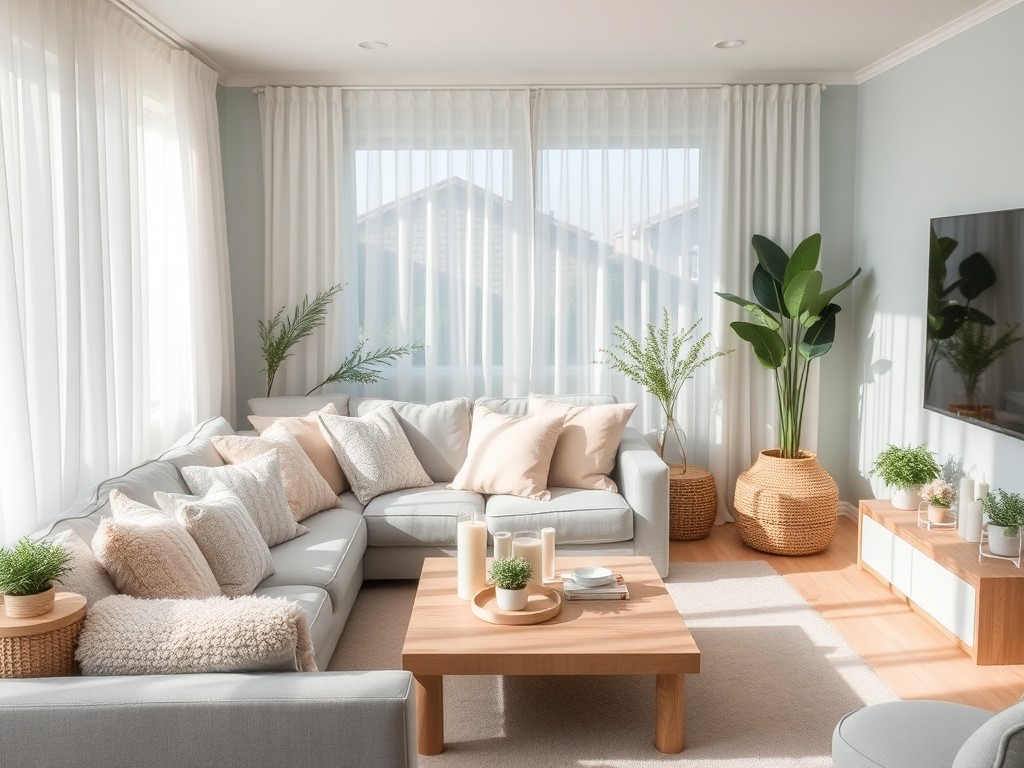
Best Colors for Creating a Calming Sanctuary
When I renovated my bedroom last year, I spent weeks testing blue paint samples. My boyfriend thought I was being ridiculously picky, but the research backed me up—certain blues genuinely help reduce stress hormones in the body. Studies from the Frontiers in Psychology journal have shown that exposure to cool-toned environments can significantly decrease stress levels and even improve sleep quality. That’s powerful medicine from something as simple as wall color!
Top calming color choices:
- Pale blue (like faded denim or misty morning skies)
- Sage green (muted, earthy, and grounding)
- Lavender (soft and contemplative without being too feminine)
- Dusty rose (nurturing without being overly stimulating)
- Soft gray with blue undertones (neutral but still soothing)
The most effective calming colors mimic elements from nature that signal safety to our primitive brains. Soft blues remind us of clear skies and calm waters. Gentle greens evoke peaceful forests and open meadows. Pale lavenders bring to mind tranquil twilight hours. These associations work deep in our subconscious, helping to create spaces that feel inherently secure and peaceful.
For maximum relaxation in bedrooms and meditation spaces, pair these calming hues with natural materials like wood and stone. Add plush textures through pillows and throws to create a multisensory experience of comfort. Keep lighting soft and warm rather than harsh and bright, which can counteract the calming effect of your color choices.
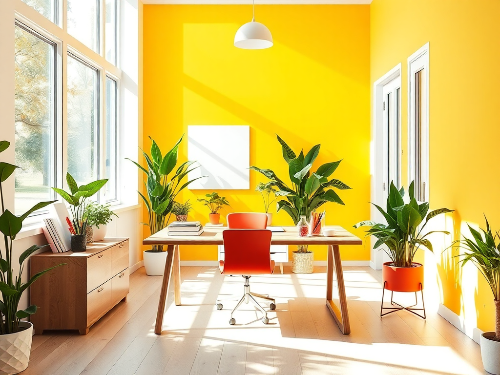
Energizing Hues That Boost Creativity and Focus
My home office wall wasn’t working for me—the beige paint made the space feel drab and uninspiring. After researching how colors affect your mood during work hours, I took a chance on a bright yellow accent wall. The difference was immediate! According to research published by the National Center for Biotechnology Information, yellow environments can boost optimism and mental clarity, making them perfect for spaces where you need cognitive energy.
Best energizing colors by use:
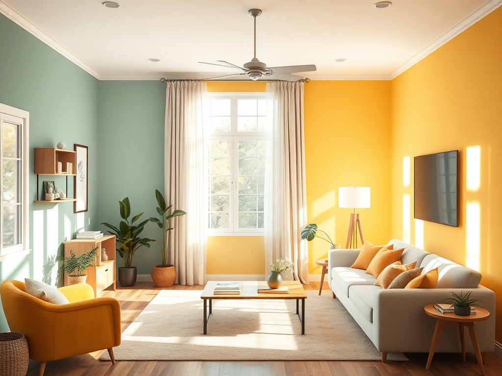
- Yellow: Ideal for offices, craft rooms, and morning spaces
- Orange: Perfect for dining rooms and social gathering areas
- Bright green: Great for spaces where innovation happens
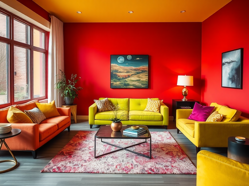
- Red accents: Use sparingly in spaces needing a burst of energy
- Turquoise: Brings focused creative energy without overstimulation
Stimulating colors work by increasing blood flow and brain activity. They literally wake up your nervous system! Red, the most activating color, can actually raise your heart rate and increase adrenaline production. That’s why it works best as an accent rather than a full room color—unless you want to feel like you’ve had three espressos at all times. Orange combines the energy of red with the cheerfulness of yellow, creating a friendly, conversation-promoting atmosphere particularly suited to dining rooms and social areas.
When incorporating energizing colors into ethnic home decor ideas or contemporary spaces, balance is crucial. Even in creative workspaces, too much stimulation can lead to distraction rather than inspiration. Use these powerful hues strategically through accent walls, furniture pieces, or decorative elements while maintaining some visual rest areas with neutrals.
“Colors are to the eye what notes are to the ear,” explains Karen Haller, an applied color psychology practitioner. “They can energize us or soothe us, depending on the hue and intensity. The trick is matching the right color energy to your desired activity in each space.”
“Colors are to the eye what notes are to the ear,”
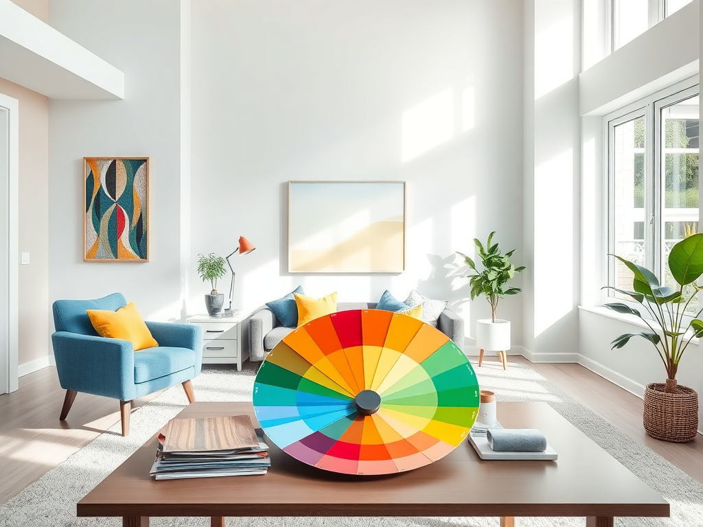
Creating Color Flow That Balances Your Home’s Energy
One mistake I made in my first apartment was treating each room as a completely separate color entity. The result was a jarring, disconnected feeling as I moved throughout my home. Now I understand that while each space can have its own mood, creating cohesive color flow helps maintain emotional balance throughout your home. Think of your color scheme as a conversation between rooms rather than isolated monologues.
Tips for balanced color flow:
- Choose a primary color temperature (warm or cool) for the entire home
- Repeat accent colors in different forms throughout various rooms
- Use neutral connecting spaces to provide visual breaks
- Consider how natural light changes colors in different rooms
- Try digital color visualization tools before committing to paint
The most effective approach is choosing a central color temperature—either primarily warm or primarily cool—for your entire home, then varying the intensity room by room. This creates subtle mood shifts without emotional whiplash. Another strategy is selecting a Cape Cod style homes color palette where a few key colors appear throughout the house in different proportions, creating unity with variety.
Transitional spaces like hallways and entryways play a crucial role in color flow. These areas can serve as visual palate cleansers, often working best in neutral shades that allow your brain to reset between the more distinctly colored living areas. They also provide perfect opportunities to incorporate small elements that preview the colors in adjoining rooms, helping to create smooth visual transitions.
Colors to Use Cautiously for Emotional Wellbeing
During my brief obsession with brutalism in interior design, I painted my bedroom charcoal gray. Big mistake! While it looked striking in magazines, living with such a dark, heavy color made mornings harder and evenings gloomier. Some colors, while beautiful, can negatively impact your emotional state when used extensively in daily living spaces.
Colors to handle with care:
- Very dark colors in small or poorly lit rooms
- Bright red in spaces meant for relaxation
- Pure bright white without softening elements
- Neon colors in areas used for extended periods
- Very cool grays in spaces that need warmth and welcome
Dark colors like black, charcoal, and navy can create sophistication and drama, but they also absorb light rather than reflect it. This absorption quality can subtly drain energy from a space—and from you by extension. These colors work beautifully as accents or in spaces meant for short-term use but can feel oppressive in rooms where you spend many hours.
Bright red deserves special caution. While energizing in small doses, extensive red can actually raise blood pressure and increase feelings of aggression or anxiety in sensitive individuals. That’s why red dining rooms make exciting dinner party spaces but might not support relaxation during everyday family meals. Pure bright white, despite its popularity, comes with its own cautions—too much can create a clinical feeling and cause eye strain from excessive light reflection.
“Color misused is color misunderstood,” notes Dr. Angela Wright, a renowned color psychologist. “The intensity, placement, and proportion of a color matter just as much as the hue itself. Even potentially overwhelming colors can serve you well when used with intention and balance.”
Practical Ways to Test How Colors Affect Your Mood
Before committing to that bold turquoise dining room that caught your eye on Pinterest, try living with the color in smaller ways. I’ve saved myself from expensive repainting projects by testing colors through temporary elements first. Start with throw pillows, artwork, or even a painted piece of poster board that you can move around the room to see how the color looks in different lighting conditions.
Smart ways to test colors:
- Use inexpensive textiles like throw pillows or blankets
- Try removable wallpaper or large color swatches
- Introduce the color through seasonal decorations first
- Observe the color in morning, afternoon, and evening light
- Pay attention to how your mood changes after spending time with the color
Pay attention to your emotional reactions over several days. Do you feel more relaxed, energized, or perhaps irritated after spending time with your test color? Our responses to color can be surprisingly personal based on our associations and experiences. What feels calming to one person might feel dull to another. Trust your authentic reactions rather than just following color psychology rules.
If you’re considering a significant color change like wall paint or large furniture pieces, take advantage of contemporary interior design tools like digital visualization apps. Many paint companies now offer apps that let you upload photos of your room and virtually paint the walls. This gives you a much more accurate preview than small paint chips alone.
Creating Your Personal Color Harmony
The most important aspect of using color psychology in your home isn’t following rigid rules—it’s creating spaces that genuinely support your well-being. Understanding how colors affect your mood gives you tools for intentional design, but your personal preferences and lifestyle needs should always guide final decisions. Your home should feel authentically yours, not like a textbook example of color theory.
Start by identifying the emotional qualities you need most in each room. Do you want your bedroom to feel like a tranquil retreat or a romantic sanctuary? Should your kitchen energize morning routines or calm evening meal prep? Once you understand the emotional purpose of each space, you can select colors that naturally support those feelings while still expressing your personal style.
Remember that color rarely works alone. Texture, lighting, and proportion all influence how we experience color in a space. A bold color can feel sophisticated rather than overwhelming when paired with rich textures and thoughtful lighting. Similarly, a subtle palette gains depth and interest through varied materials and careful composition. The most successful rooms balance color psychology principles with these other sensory elements.
Creating a home that supports your emotional well-being through color doesn’t require a complete overhaul or perfect adherence to color rules. Start with one room that needs attention, experiment thoughtfully, and enjoy the process of discovering what truly works for you. After all, the best measure of successful color use isn’t how closely it follows psychology principles but how genuinely it improves your daily life and happiness at home.